How to Customise Your Zoho CRM Dashboard for Your Sales Team
Step 1: Audit Your Current Dashboard
Before adding or changing anything, identify what your current dashboard is and is not answering. Ask the team members who use it one question: when you open this dashboard, what question does it fail to answer that you then have to look elsewhere to find? The most common answers — I can’t see which deals are stalled, I don’t know what my team’s activity volume was this week, I can’t tell which lead source is producing the most revenue — become your customisation agenda.
Also identify which widgets on the current dashboard nobody uses. Dashboards accumulate unused widgets over time — charts that made sense when they were added but whose relevance has faded as the business changed. Remove them. A dashboard with seven relevant, action-oriented widgets is checked daily. A dashboard with 15 widgets — half of which are irrelevant — is checked occasionally.
Step 2: Add and Configure Widgets
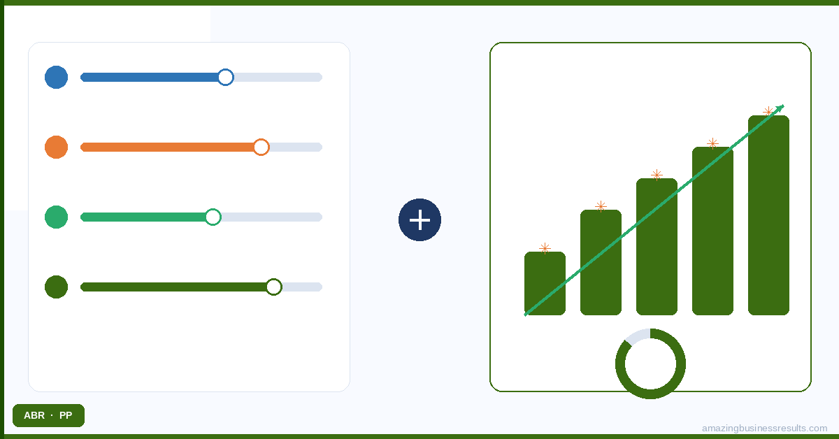
To add a widget to an existing dashboard, open the dashboard and click “Add Component” in the top right corner. Select the report the widget will draw from, then choose the visualisation type. The key configuration decisions for each widget are:
- Chart type — match the chart to the data structure. Pipeline by stage: horizontal bar (makes comparison across categories clear). Revenue trend over time: line chart (shows direction and rate of change). Deal distribution by source: pie or donut (shows proportional breakdown). Always choose the chart type that makes the answer to the underlying question immediately visible without effort.
- Date range filter — every widget should have an explicit date range. A pipeline value chart with no date filter shows all deals ever created, not current pipeline. Set the date range to match the management question: “this quarter” for pipeline review, “last 12 weeks” for trend analysis, “this month” for close rate tracking.
- Grouping and aggregation — summary widgets show a total number (total pipeline value, total deals this month). Breakdown widgets show a grouped metric (pipeline by stage, revenue by rep). Match the aggregation to the management question — a manager asking “how is my team performing” needs breakdown by rep; a manager asking “are we on track for quota” needs a total vs target number.
Step 3: Add KPI Metric Cards and Targets
KPI metric cards display a single large number — total open pipeline value, number of deals closing this month, total calls logged this week. They are the most scanned element on any dashboard and the fastest way to give managers the “are we on track” answer at a glance.
Zoho CRM’s target meter widget adds a goal line to a KPI card — showing actual value alongside the target. A monthly revenue target meter showing $180,000 actual vs $200,000 target at 90% completion tells a manager more than a raw revenue number. Set targets in the widget configuration using a fixed value (your monthly quota) or a calculated field.
Step 4: Resize and Reorder Widgets
Dashboard layout matters as much as widget selection. The eye goes to the top left first, then across and down. Place your most critical KPI metric cards in the top row — pipeline value, deals closing this month, activity count this week. Place your most important trend charts in the second row. Place action lists (stalled deals, overdue tasks) in the lower section where they are always visible but do not dominate the first impression.
Resize widgets by dragging their bottom-right corner. KPI metric cards look best at quarter-width. Full trend charts need at least half-width to show data clearly. Avoid making all widgets the same size — visual hierarchy guides attention more effectively than uniform grid layouts.
Step 5: Create Separate Dashboards for Different Teams
A single dashboard cannot serve a sales rep and a sales manager equally well. A rep needs to see their own activity queue, their own deals and their personal targets. A manager needs to see the whole team’s activity, the combined pipeline and rep-level performance breakdowns.
Create a separate dashboard for each distinct audience: a Rep Dashboard (personal metrics, open deals, overdue tasks), a Manager Dashboard (team pipeline, activity by rep, close rate trends) and optionally an Executive Dashboard (revenue vs target, forecast, conversion funnel). Share each dashboard with the relevant user profiles — see the Zoho CRM user permissions guide for profile-based sharing.
Step 6: Set the Dashboard as the Default Home Screen
The single most effective way to drive daily dashboard usage is to set the relevant dashboard as the default home screen for each profile. When a sales rep logs in and immediately sees their deal pipeline, activity queue and targets, the dashboard becomes part of their morning routine rather than an optional destination they sometimes visit.
To set a default home screen: open the dashboard, click the settings icon and select “Set as Home Page for” — then choose the profile. Each profile can have a different default dashboard. Managers log in to their pipeline overview. Reps log in to their personal activity and deal dashboard.
Frequently Asked Questions
What should a sales manager's Zoho CRM dashboard include?
Can I have different dashboards for different teams in Zoho CRM?
Can external stakeholders see Zoho CRM dashboards?
How do I add a new widget to a Zoho CRM dashboard?
Can ABR build our Zoho CRM dashboards?